Yield Curve Inversion: Maybe It’s Different This Time

On March 22, the 10-year Treasury yield fell below the three-month Treasury yield, an unusual occurrence called a yield curve inversion. The event occasioned scare stories by the media, with headlines such as “Yield curve inversion: recession sign sparks panic.” The market sold off a bit.

Here’s a chart showing the 10-year-minus-3-month yield spread going back to 1982 (the longest period available from FRED). When the line dips below the x-axis, the yield curve is inverted. The gray areas indicate recession.

10Y-3M spread.PNG

Every U.S. recession in the past 50 or so years was preceded by a yield curve inversion by at most two years. However, the archetypal market cycle is about seven years, so having predictive power over a two-year horizon is not as prescient as it sounds.

Economist Campbell Harvey is credited with discovering the predictive power of yield curve inversions in his 1986 PhD dissertation. He found that the 5-year-minus-3-month spread predicted recession within two years if it was inverted for three months.

There isn’t just one official measure of yield curve inversions, but many. You can take the spread of any pair of Treasury maturities. The two most followed measures, however, are the 10-year-minus-2-year and 10-year-minus-3-month spreads. The 10-year-minus-2-year spread (the Fed’s preferred measure) is not inverted, so the two biggest indicators are conflicting right now.

A lot has been written on the yield curve inversion’s predictive power, but less on why. Once you look at the economic mechanisms behind yield curve inversions, the recent occurrence is far less portentous.

Let’s start with the basics. Treasuries are bonds issued by the Treasury department in maturities ranging from one month to 30 years. Because the U.S. government can print dollars, Treasuries are free of default risk. And because inflation has been kept under control for 30+ years by the Federal Reserve, markets treat Treasuries as if they now have little inflation risk, too. Most of the time investors demand higher yields for longer maturities, resulting in an upward sloping yield curve as shown in the chart below, which shows data from the beginning of 2014.

The Treasury yield curve is largely set by two forces:

  1. The expected path of short-term Treasury yields, which is controlled by the Federal Reserve.

  2. The term premium, the additional yield investors demand for running the risk that short-term interest rates don’t evolve in the expected manner.

In the past decade, the term premium has become much smaller and less volatile, so most changes to the yield curve mostly reflect changes to the market’s expectations of how Fed policy will evolve. This is especially true for short maturities.

In the chart below, I’ve added the yield curve as of March end.

It’s remarkably flat compared to the yield curve in the beginning of 2014.

Yield curve inversions are the result of a combination of two forces:

  1. Bond investors expect the Fed to begin lowering short-term rates, almost always in response to slowing growth.

  2. The term premium falls, usually in times of economic stress, as investors prefer the safety and certainty of longer-term Treasuries.

Economically, you’d expect most of the forecasting power of the yield curve inversion signal to come from the first factor, the expectation of easier Fed policy in response to slowing growth.

If you ignore the term premium, the current yield curve is telling us that that Fed is expected to cut short-term rates next year (by about 0.25% to 0.5%), which is normally a sign that the economy is slowing at a worrisome rate. Remarkably, it’s also forecasting that the Fed funds rate will average under 2.4% over the next 10 years, which is consistent with a deflationary, low-growth environment.

What is the yield curve telling us once you account for the term premium?

The term premium is not directly observable. It is estimated by subtracting investors’ expectations of the future path of Fed policy from the Treasury yield. Most models of the term premium agree that since the early 80s, when inflation and interest rates peaked, the term premium has gradually fallen and in recent years turned negative. (Why is beyond the scope of this post, but may be related to an aging population.)

The Federal Reserve Bank of New York publishes daily estimates of term premia according to a model developed by staff economists Tobias Adrian, Richard Crump, and Emanuel Moench (“ACM”). The ACM model estimates that the 10-year Treasury term premium is -0.8% as of March end. In other words, investors think short-term rates will average 3.2% over 10 years, but will buy a 10-year Treasury yielding 2.4% now to lock in that rate, according to this particular model.

The negative term premium has made it much easier for the yield curve to invert with small changes in the expected path of short-term interest rates. Indeed, the yield curve can now invert even when the expected path of short-term rates is positive, which was not true for most of the post-war era.

The chart below shows the Treasury yield curve minus the ACM term premia estimates as of the beginning of 2007 (around the time of the last yield curve inversion) and as of March end. The ACM model estimates that in 2007 the “pure” yield curve that reflects only the market’s expectations of Fed policy was indeed inverted. In contrast, the model says that today’s “pure” yield curve is not inverted—the market still expects a mildly upward sloping path for short-term interest rates.

Interestingly, the 10-year-minus-3-month spread went negative the day president Donald Trump announced he would nominate Stephen Moore to the Fed board. Moore is a Republican partisan. During the Obama years, he railed against the Fed’s easy monetary policy. After Trump slammed Fed chair Jerome Powell for hiking the Fed funds rate in December, Moore penned an op-ed, “Fire the Fed,” signaling to Trump that he would follow orders, practically begging for a spot on the Fed board.

Moore is likely to be confirmed by the Senate, and the Fed board will increasingly reflect Trump’s preference for easier monetary policy. The inversion of the yield curve, especially on the short end, may reflect this political reality more than it does growth fears. If this is the case, the recent yield curve inversion is ironically good news for stocks in the near term.

Waiting for the Market to Crash is a Terrible Strategy

In my experience, investors sitting on a lot of cash are usually worried about equity valuations or the economy, and tell themselves and others that they're going to buy gobs of stock after a crash. The strategy sounds prudent and has commonsense appeal—everyone knows that one should be fearful when others are greedy, greedy when others are fearful. But historically waiting for the market to fall has been an abysmal strategy, far worse than buying and holding in both absolute and risk-adjusted terms.

Using monthly U.S. stock market total returns from mid-1926 to 2016-end (from the ever-useful French Data Library), I simulated variations of the strategy, changing both the drawdown thresholds before buying and the holding periods after a buy. For example, a simple version of the strategy is to wait for a 10% peak-to-trough loss before buying, then holding for at least 12 months or until the drawdown threshold is exceeded before returning to cash. This strategy would have put you in cash about 47% of the time, so if our switches were random, we’d expect to earn about half the market return with half the volatility.

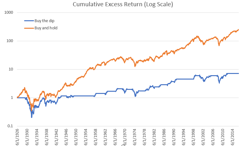
The chart below shows the cumulative excess return (that is, return above cash) of this variation of the strategy versus the market. Buy-the-dip returned 2.2% annualized with a 15.7% annualized standard deviation, while buy-and-hold returned 6.3% with an 18.6% standard deviation. Their respective Sharpe ratios, a measure of risk-adjusted return, are 0.14 and 0.34, meaning for each percentage point of volatility buy-the-dip yielded 0.14% in additional annualized return and buy-and-hold yielded 0.34%.

The above chart understates the terribleness of the strategy. In the chart below I plot the cumulative wealth ratio of the strategy over the market to show their relative performances. When the line is sloping down, dip-buying is underperforming; when it's sloping up, it's overperforming. As you can see, the line shows small jags of outperformance, expansive plateaus of neutral performance, and long rolling slopes of underperformance.

What about waiting for a deeper crash? For every drawdown level from -10% to -50% (in increments of 5%), waiting for a crash before buying results in lower absolute and risk-adjusted returns.

12 month holding.PNG

What about holding on longer? This helps, but not enough to make it a winning strategy. Here’s what holding for three years after a crash produces:

Holding for five years helps, too, but now we're getting closer to buy and hold:

None of the variations tested produces higher absolute or risk-adjusted returns than buy and hold.

The strategy fails for two reasons. First, the historical equity risk premium was high and decades could pass before a big-enough crash, making it very costly to sit in cash. Second, the market tended to exhibit momentum more than mean reversion over years-long horizons. As strange as it sounds, you would have been better off buying when the market was going up and selling when it was going down, using a trend-following rule.

The closest thing to a success is waiting for a 40% or 45% crash before buying, and then holding on for at least five years. That strategy would have captured more than half the market’s return while being exposed to the market only a third of the time. However, 40%+ crashes are rare, occurring only five times in our sample, or about once every 18 years. The best that can be said for our strategy is that medium-term returns after a big crash tended to be above average, so it's probably a good time to buy equities if you have cash sitting around and a multi-year horizon.

This data does not say you should always buy and hold, no matter what. It simply says that a mechanical strategy of waiting for a crash on average resulted in much worse absolute and risk-adjusted returns than buying and holding. It is conceivable that you could have some piece of information—say, market valuations or economic conditions or technicals—that indicates a big crash is more likely to occur. In fact, a drawdown from a prior peak is itself just such a piece of information, because bad returns tend to clump together.

The Danger in Valuation-Based Market Timing

One of the most dangerous things for an investor to do is to make big changes to his asset allocation based on valuations. Valuation-based tactical asset allocation has proven very hard to execute over time, for a simple reason: Asset-class valuations do not exhibit much mean reversion. In fact, they often exhibit prolonged regime shifts. A dramatic example of this can be seen in Treasury yields.

Exhibit 1 shows that long-term Treasury yields have moved in decades-long regimes of either falling or rising rates. A hypothetical investor in the 50s who observed that yields were at 20-year highs and unlikely to rise further would have been wrong for over 30 years. On the flip side, an investor in the mid 80s who stayed out of the bond market on the expectation that yields would spike again would have been wrong for 30 years (and counting!). These long-lasting changes to bond yields can’t be adequately explained by secular changes in inflation, as investors persistently underestimated future inflation during the 60s to 80s and persistently overestimated future inflation from the 80s and on. (To finance nerds, the market being wrong on inflation for decades on end is a puzzle; in a reasonably efficient market, inflation surprises should be random.)

The stock market has also exhibited big, long-lasting shifts in valuations that have frustrated value-conscious investors who have tried to get out when the market looked “expensive” and buy when it was “cheap.” Exhibit 2 shows the cyclically adjusted earnings yield of the S&P 500, calculated by taking 10 years of inflation-adjusted per-share earnings and dividing it by price (the inverse of the famous Shiller price-to-earnings ratio). There are decades where valuations can remain elevated or depressed relative to history. The poor value investor who got out of the stock market in the mid-90s as the earnings yield hit hit lows unseen since the late 60s—almost 25 years prior—would have sat out much of the fantastic returns generated by the dot-com bubble. Some very smart investors did just that, with disastrous consequences for their careers.
 

Source: Robert Shiller's online data website.

Source: Robert Shiller's online data website.

The tendency for valuations to remain at extreme levels relative to history for years or even decades makes contrarian asset allocation a frustrating and dangerous exercise. Even with the benefit of hindsight, it is hard to come up with a simple valuation timing model that doesn’t suffer from decade-long dry spells of underperformance. The most successful practitioners of market-timing strategies (George Soros and Stanley Druckenmiller) are largely trend-followers.

Does this mean we should ignore valuations when determining our asset allocations? No. There is still some hope for the valuation-conscious tactical asset allocator. Warren Buffett famously made two market calls: In July 1999, he gave a talk at the Allen Sun Valley Conference where he predicted that stock returns would be much lower than widely expected. The market peaked within a year and collapsed. In October 2008, he wrote an editorial in the New York Times urging investors to “Buy American.” The market bottomed five months later. While Buffett grounded his analyses in valuations, valuations alone can’t account for his uncanny timing. In both cases, he noted the acute, widespread certainty on part of market participants that the market would be heading in only one direction (up in 1999, down in 2008). This suggests that to the extent investors must market time based on valuations, they should not just focus on valuation, but also bet against extreme sentiment, the kind that appears at most once in a decade.


When to be Scared of the Stock Market

This post first appeared in the August Mutual Fund Observer.

Sometimes it is sensible to be scared of being in the stock market. Those times are rare. I want to describe them from the perspective of a value investor, who only cares about the future cash flows of his investments; I am not offering a method of short-term market timing.

The key fact to grasp is just how resilient corporate earnings are in a big, developed country with strong institutions. The chart below shows the per-share inflation-adjusted earnings of the S&P 500 as well as its 10-year moving average. Though there are violent swings in the per-share earnings series, the moving average shows that the normalized earnings power of U.S. publicly traded corporations grew right through them, rarely reversing for long. Over this period, the U.S. experienced the Great Depression, two world wars, the Cold War, massive corporate tax hikes, oil crises, stagflation, corrupt and incompetent leaders, the 9/11 attacks, countless scandals in leading corporations, the financial crisis and so on.

To the long-term value investor, there are really only a handful of circumstances that warrant a retreat from the stock market:

Prices are so high that the return on stocks over the long run cannot plausibly be much higher than that of other assets such as bonds. During the dot-com bubble, the cyclically-adjusted earnings yield of the market fell to a little over 2% while 30-year Treasury Inflation-Protected Securities yielded over 4%. For a value-oriented investor to have justified owning the stock market as a whole, he had to assume—dream of, really—fantastically high earnings growth.

The future earnings power of the market is severely impaired or destroyed and this fact is not reflected in prices. This scenario is apocalyptic and has never occurred in the U.S. For a large, developed country’s corporate sector to be permanently maimed, it would either have to be bombed to rubble as Germany and Japan were during World War II or property rights would have to disappear as in Russia during the Russian Revolution. Severe recessions do not noticeably dent the stock market’s future earnings power. A rule of thumb in determining whether a market’s earnings power is at risk of permanent impairment is if significant numbers of citizens are fleeing or want to flee the country for their personal safety.

Discount rates will rise a lot and stay high for a long time. In other words, investors for whatever reason will demand a much lower valuation in stocks, requiring current prices to fall a lot. During the 1970s and early 1980s, rising inflation and nominal interest rates caused investors to demand absurdly low valuations to own stocks. As inflation and interest rates ratcheted up, stock valuations kept ratcheting down. (With the benefit of hindsight, many analysts think that investors were suffering from the money illusion, using the era’s high nominal rates to discount real earnings.) This is a blessing for some. Current dollars invested in the market will take a big, permanent hit, but any future dollars invested in the market will earn a higher rate of return. A secular rise in discount rates is a massive transfer of wealth from the old, who have much of their net worth in financial assets, to the young, who have decades of earnings ahead of them that they can plow into cheap financial assets.

How does this apply to the current market outlook? Valuations are high, but not implausibly high given real yields on bonds. The U.S. stock market’s cyclically-adjusted earnings yield is around 4% while the 30-year TIPS yields less than 1%. Moreover, today’s problems are trivial compared to the existential threats that have loomed in the past. Even if the Eurozone and China blew up at the same time and threw the world into another depression, the long-run underlying earnings power of the rich world’s corporate sector will very likely not be permanently devastated. Valuations would cheapen, for sure, but that would indicate a buying opportunity. (Investors in developing markets, on the other hand, would probably take a permanent hit.)

What concerns me most is that interest rates—real and nominal—are so low everywhere. If the world were to enter an era of rising interest rates as we experienced in the 70s and early 80s, the mighty tailwind that’s boosted valuations over the past 30-plus years would turn into a long-lived headwind. This is a truly frightening scenario that implies years or even decades of puny returns in virtually all financial assets.

Contrast these considerations with media chatter. Everyone talks about and focuses on things that do not truly affect the intrinsic value of the market. The times to be scared are when 1) everyone is euphoric and realistic appraisals of future earnings cannot justify current prices, 2) people are fleeing the country or want to flee the country due to fears over personal safety, or 3) real rates enter a period of secular increases.

Every Active Fund is a Long-Short Fund: A Simple Framework for Assessing the Quality, Quantity and Cost of Active Management

This post first appeared in the June Mutual Fund Observer.

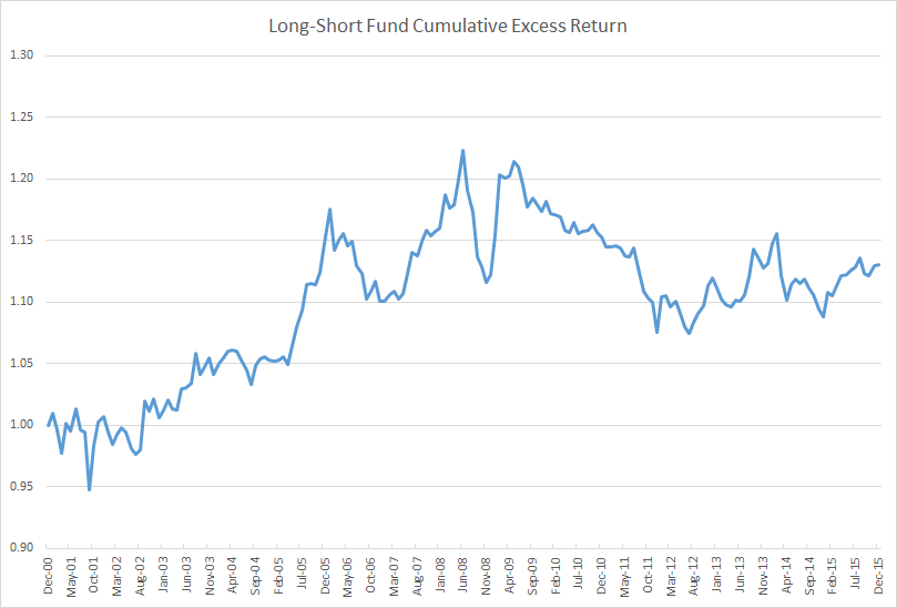
Here’s a chart of the 15-year cumulative excess return (that is, return above cash) of a long-short fund. Over this period, the fund generated an annualized excess return of 0.82% with an annualized standard deviation of 4.35%. The fund charges 0.66% and many advisors who sell it take a 5.75% commission off the top.

Though its best returns came during the financial crisis, making it a good diversifier, I suspect few would rush out to buy this fund. Its performance is inconsistent, its reward-to-risk ratio of 0.19 is mediocre, and its effective performance fee of 44% is comparable to that of a hedge fund. There are plenty of better-performing market-neutral or long-short funds with lower effective fees.

Despite the unremarkable record, about $140 billion is invested in a version of this strategy under the name of American Funds Growth Fund of America AGTHX. I simply subtracted the Standard & Poor’s 500 Index’s monthly total return from AGTHX’s monthly total return to create the long-short excess return track record (total return would include the return of cash).

This is an unconventional way of viewing a fund’s performance. But I think it is the right way, because, in a real sense, every active fund is a long-short strategy plus its benchmark.

Ignoring regulatory or legal hurdles, a fund manager can convert any long-only fund into a long-short fund by shorting the fund’s benchmark. He can also convert a long-short fund into a long-only fund by buying benchmark exposure on top of it (and closing out any residuals shorts). I could do the same thing to any fund I own through a futures account by overlaying or subtracting benchmark exposure.

Viewing funds this way has three major benefits. First, it allows you to visualize the timing and magnitude of a fund’s excess returns, which can alter your perception of a fund’s returns in major ways versus looking at a total return table or eyeballing a total return chart. Looking at a fund’s three-, five- and ten-year trailing returns tells you precious little about a fund’s consistency and the timing of its returns. The ten-year return contains the five-year return which contains the three-year return which contains the one-year return. (If someone says a fund’s returns are consistent, citing 3-, 5-, and 10-year returns, watch out!) Rolling period returns are a step up, but neither technique has the fidelity and elegance of simply cumulating a fund’s excess returns.

Second, it makes clear the price, historical quantity and historical quality of a fund’s active management. The “quantity” of a fund’s active management is its tracking error, or the volatility of the fund’s returns in excess of its benchmark. The “quality” of a fund’s management is its information ratio, or excess return divided by tracking error. Taking these two factors into consideration, it becomes clearer whether a fund has offered a good value or not. A fund shouldn’t automatically be branded expensive based on its expense ratio observed in isolation. I would happily give up my left pinky for the privilege of investing in Renaissance Technologies’ Medallion fund, which charges up to 5% of assets and 44% of net profits, and I would consider myself lucky.

Finally, it allows you to coherently assess alternative investments such as market-neutral funds on the same footing as long-only active managers. A depressingly common error in assessing long-short or market neutral funds is to compare their returns against the raw returns of long-only funds or benchmarks. A market neutral fund should be compared against the active component of a long-only manager’s returns.

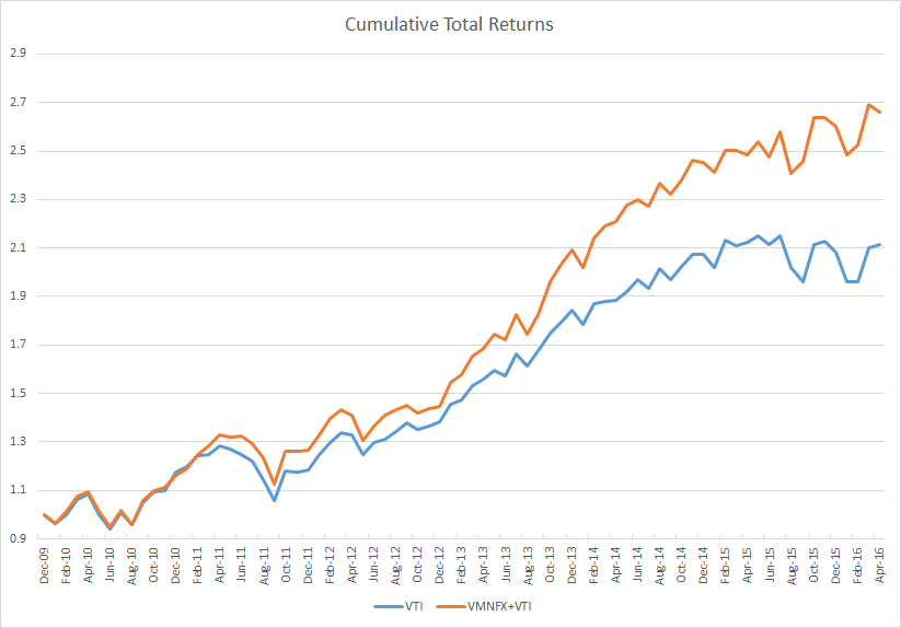
To make these lessons concrete, let’s perform a simple case study with two funds: Vulcan Value Partners Small Cap VVPSX and Vanguard Market Neutral VMNFX. Here’s a total return chart for both funds since the Vulcan fund’s inception on December 30, 2009. (Note that Vanguard Market Neutral was co-managed by AXA Rosenberg until late 2010, after which Vanguard’s Quantitative Equity Group took full control.)

Given the choice between the two funds, which would you include in your portfolio? Over this period the Vanguard fund returned a paltry 3.7% annually and the Vulcan fund a blistering 14.2%. If you could only own one fund in your portfolio, the Vulcan fund is probably the better choice as it benefits from exposure to market risk and therefore has a much higher expected return. However, if you are looking for the fund that enhances the risk-adjusted return of portfolio, there isn’t enough information to say at this point; it is meaningless to compare a fund with market exposure with a market neutral fund on a total return basis.

A good alternative fund usually neutralizes benchmark-like exposure and leave only active, or skilled-based, returns. A fairer comparison of the two funds would strip out market exposure from Vulcan Small Cap (or, equivalently, add benchmark exposure to Vanguard Market Neutral). In the chart below, I subtracted the returns of the Vanguard Small Cap Value ETF VBR, which tracks the CRSP US Small Cap Value Index, from the Vulcan fund’s returns. While the Vulcan fund benchmarks itself against the Russell 2000 Value index, the Russell 2000 is terribly flawed and has historically lost about 1% to 2% a year to index reconstitution costs. Small-cap managers love the Russell 2000 and its variations because it is a much easier benchmark to beat. Technically, I’m also supposed to subtract the cash return (something like the 3-month T-bill or LIBOR rate) from Vanguard Market Neutral, but cash yields have effectively remained 0% over this period.

When comparing both funds simply based on their active returns, Vanguard Market Neutral Fund looks outstanding. Investors have paid a remarkably low management fee (0.25%) for strong and consistent outperformance. Even better, the fund’s outperformance was not correlated with broad market movements.

This is not to say that Vanguard has the better fund simply based on past performance. Historical quantitative analysis should supplement, not supplant, qualitative judgment. The quality of the managers and the process have to be taken into account when making a forecast of future outperformance as a fund’s past excess return is very loosely related to its future excess return. There is a short-term correlation, where high recent excess return predicts high future near-term excess return due to a momentum effect, but over longer horizons there is little evidence that high past return predicts high future return. Confusingly, low long-run excess returns predict low future returns, suggesting evidence of persistent negative skill. If a fund has historically displayed a long-term pattern of low active exposure and negative excess returns, its fees should either be extremely low or you shouldn’t own it at all.


There’s a puzzle here. Imagine if Vanguard Market Neutral’s managers simply overlaid static market exposure on their fund. Here’s how their fund would have performed.

A long-only fund that has beaten the market by 3.7% a year with minimal downside tracking error over five years would easily attract billions of dollars. But here Vanguard is, wallowing is relative obscurity, despite having remarkably low absolute and relative costs.

Why is this? In theory, the price of active management—in whatever form—should tend to equalize in a competitive market. However, what we see is that long-only active management tends to dominate and is often wildly expensive relative to the true exposures offered, and long-short active management tends to often repackage market beta and overcharge for it, creating pockets of outstanding value among strategies that are truly market neutral and highly active.

I think three forces are at work:

  1. Investors do not adjust a fund’s returns for its beta exposures. A high return fund, even if it’s mostly from beta, tends to attract assets despite extremely high fees for the actively managed portion.
  2. Investors focus on absolute expense ratios, often ignoring the level of active exposure obtained.
  3. Investors are uncomfortable with unconventional strategies that use leverage and derivatives and incur high tracking error.

Given these facts, a profit-maximizing fund company will be most rewarded by offering up closet index funds. Alternative managers will offer up market beta in a different form. Active managers that offer truly market neutral exposure will be punished due to their unconventionality and comparisons against forms of active management where beta exposures are baked into the track record.

 Investment Implications

When choosing among active strategies, all sources of excess return should be on a level playing field. There is no reason to compare long-only active managers against other long-only active managers. Your portfolio doesn’t care where it gets its excess returns from and neither should you.

However, because investors tend to anchor heavily on absolute expense ratios, the price of active management offered in a long-only format tends to be much more expensive per unit of exposure than in a long-short format. An efficient way to obtain active management while keeping tracking error in check is to construct a barbell of low-cost benchmark-like funds and higher-cost alternative funds.